Projects

The University of Hull.
Unsame old story since 1927.


“Hull… Where is it exactly?”.

This question was the premise to an extraordinary journey for our team. Some of our Aussie and Italian team members were not able to locate Hull on the map of England. And what was even more telling, was that many people we met every time we flew into London, were equally unsure.

We were tasked with evolving the brand strategy and identity of the University of Hull. You know – that city in Northern England, facing the North Sea. The university was approaching its centenary in a time of great challenges. Brexit had dealt a blow to the higher education sector, Hull’s glorious maritime tradition was a thing of the past, and the University had progressively seen its student catchment narrowing to the point of being described as a ‘hyperlocal’ university.

“We’re at the end of the train line, not a great place to be if you want to bring students here from across the Country” – was a common remark in the first interviews we ran on campus. It became apparent straightaway that the University lacked both prominence and confidence.

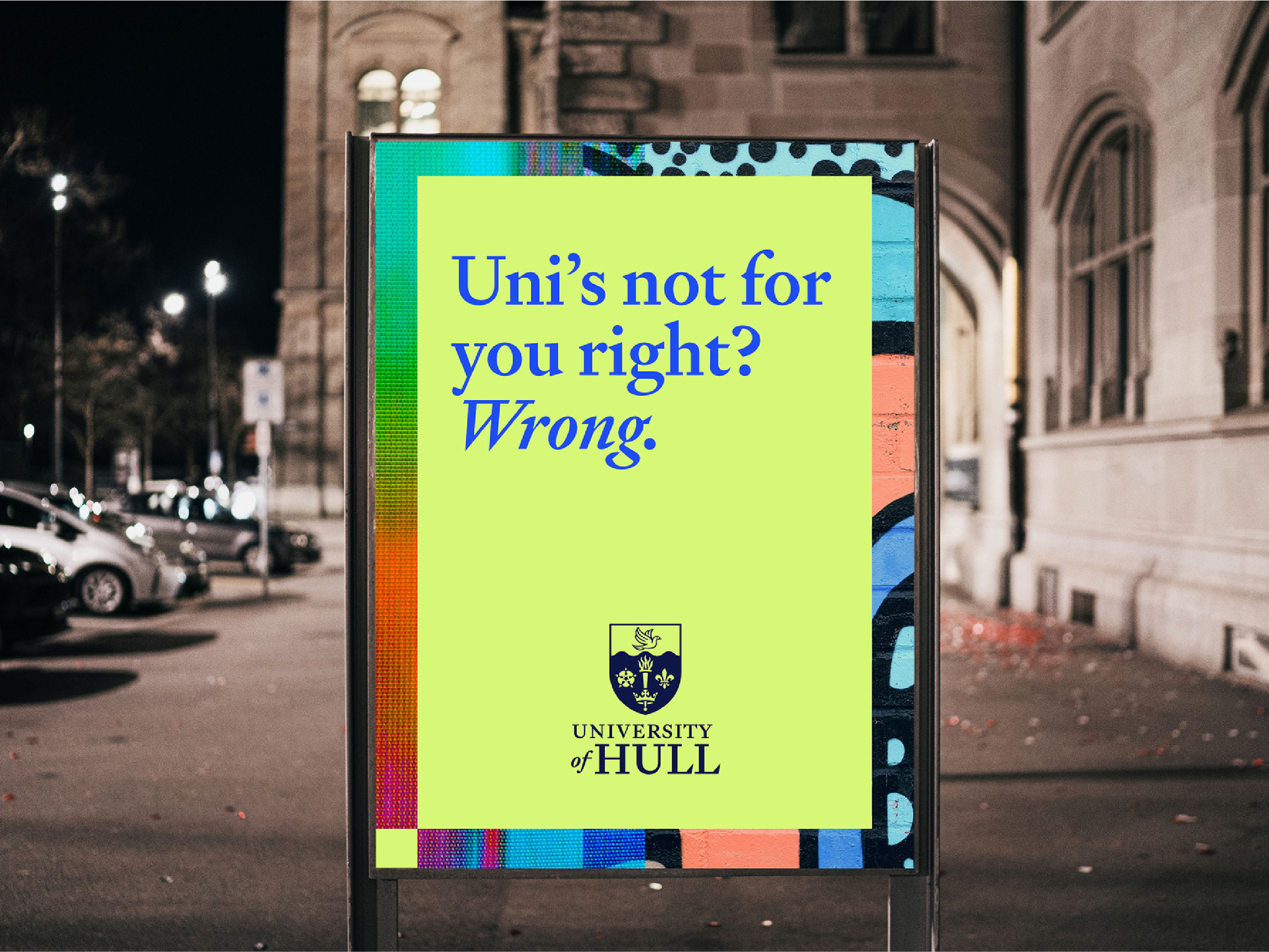
A place of many contradictions waiting to be reframed

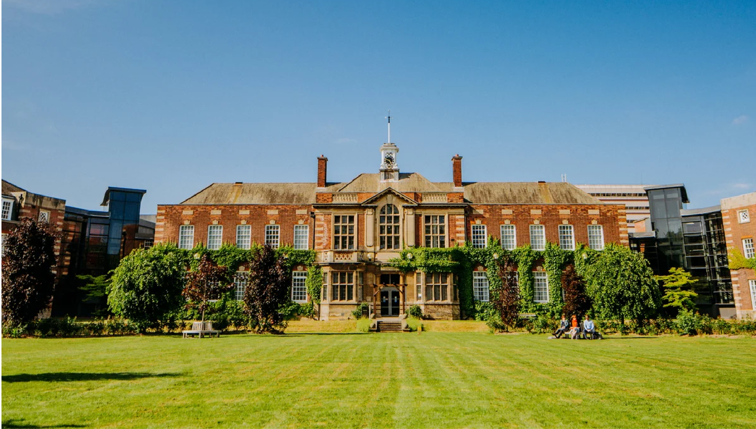
Yet, as a counterpoint to these struggles, we found an accomplished faculty and a leadership team driving a remarkable renewal. All on a beautiful campus, with several areas of academic excellence. And while Hull is one of the most deprived cities in England, it's also very attractive for its affordability and open-arms attitude. And its region, the Humber, is a special place for a university to get involved and make a difference: on one hand it's UK’s largest industrial emitter of CO2 and dangerously prone to flooding; on the other hand, it's UK’s ‘Green Energy Estuary’, at the forefront of investments in renewable energy and mitigation of climate change’s impact.

We understood from the outset that the University brand needed to reframe the many contradictions of its context. So, we designed a project that allowed for a deep two-way immersion into Hull's culture and set up a team with members in England, Australia and Italy to provide the right mix of insider and outsider perspectives.

Turns out, life starts at the end of the line

During the discovery stage, we conducted ethnographic research that provided many ‘ah-ha’ moments. Hull was starting to show us the power of paradox that lay waiting to be tapped.

We walked the streets of Hull with journalists and graffiti artists, had a drink with baristas and chefs, were introduced to the vibrant local startup scene, and walked the corridors of the magnificent Town Hall.

We discovered this city’s real character, driven by an underdog attitude and a streak of communal non-conformism on steroids – an irrepressible sense of independence coupled with a heartfelt community spirit. Something so refreshing and energising in a same-same world!

This prompted us to wonder if Hull’s character might be the engine for injecting new meaning – and greater confidence – into the University’s brand. Armed with this hypothesis, we ran extensive consultations with current and prospective students, academics and career advisors while the University’s market research team developed a new student segmentation model.

Rebels with a cause

During our consultations, we came to appreciate how rich and relevant the histories of the University and of Hull are – both defined by an anti-establishment attitude and a focus on progressive causes.

The English Civil War started in Hull, sparked by an act of defiance by the city against the king; it was the birth city of William Wilberforce, a key figure in the abolition of the Atlantic slave trade; Hull’s firebrand Lillian Bilocca led the Headscarf Revolutionaries fighting to improve the safety of men at sea; in Hull the great poet Philip Larkin found refuge – and spent thirty years working as a librarian at the University.

And the city’s cultural imprint found an echo in the achievements, the people and the everyday vibe of the University – a mid-sized institution that punches well above its weight for its work in the fields of social justice, the environment and healthcare.

"We have an enormous history and we’ve got a significant maritime history. In many ways we can look at ourselves as a Northern European connector. We can be the gateway. (…) There is a lot that talks about how progressive this community has been by looking into the bigger world: (...) the slave trade for the UK, for the whole empire, ended here."

University’s staff

The discovery stage of the project led to embracing a strategic shift: turning a friendly yet insular university into a civic university, at one with its city, excelling across a broad range of fields.

The new brand strategy positions the University as the place to be for freethinkers, from all over the Country and beyond, who want to drive change in the real world.

The strategy has become an integral part in the University’s transformation program and the basis for the evolution of the University’s brand identity and its approach to student recruitment and community engagement.

A new identity that bridges unconventional thinking and community spirit

The University of Hull’s brand identity has been completely overhauled.

This began with redesigning its brandmark – a highly symbolic task signifying change. We wanted to execute the task with the greatest respect for the heraldic value of the symbols associated with the University: the torch, representing learning; the Yorkshire rose; the coronet of the City of Hull; the fleur-de-lys of Lincolnshire; and the dove from the coat of arms of Thomas Ferens, the university’s founding father.

We engaged renowned calligraphist and designer Peter Horridge to work with our team. Peter is one of the world’s foremost experts in the evolution of heritage brandmarks and coats of arms.

The new brandmark celebrates the heritage of the University with greater authority and provides the ‘anchor’ for a whole new identity freed to capture the non-conformist attitude of the brand.

The new brand identity is born from the combination of visual, verbal and sonic identities – all informed by three goals to:

  1. bridge the twin forces of community spirit and unconventional thinking,
  2. leverage the university’s history while injecting a contemporary edge inspired by the streets of Hull, and
  3. show how the University is equally defined by what happens on-campus as by its engagement with the wider world.

Built around some highly distinctive design choices – such as adopting chartreuse as the key colour and introducing a dynamic H shape – the new identity spans a variety of contexts and expressions.

This ability to stretch, while remaining coherent and recognisable, is informed by the codification of three ‘looks’: a default core look, an avant-garde look for the world of research, and a casual look for the world of sports and wellbeing.

Featuring 'freethinking future makers'

The visual identity places special emphasis on the role of photography and textures. Students and staff are portrayed in small groups, like rock bands, all with a strong attitude yet also looking out to each other. Textures, created by local artists, are inspired by the defiant spirit of Hull’s graffiti and the young tech startup scene.

"You know, rules don't come out this far. London has rules and Leeds has rules, but we kind of don't really have rules. So there's a certain sense of liberation and freedom in the people.”

Interviews with people in the streets of Hull

Engaging with irreverence

The edge of the identity comes in no small part from the brand voice: irreverent at its core, it informs headlines written around paradoxes, candid questions and unconventional expressions. The intensity of its irreverence is dialled up and down depending on the audience and the message, balancing distinctiveness and suitability to the context.

We even coined a new word to encapsulate the unique spirit of the university’s stance on, well, just about everything. This university’s willingness to stand up and stand out goes beyond overworked adjectives like ‘different’ or ‘diverse’. It’s the ability to be truly ‘unsame’ in a conformist world that makes Hull, Hull.

Giving the brand a new voice was not enough. We partnered with PUSH’s long-time friends at Samplify to design a new sound identity. It includes both a sonic logo and a suite of music beds. It adds a distinctive flair to any medium where audio enhances the brand experience.

A brand that reaches out the classroom

The new brand identity has been brought to life across the entire organisation and its external offshoots through an evolved brand architecture. Special attention has been placed on entities created in partnership with industry and on the University’s sports facilities, a key driver of student recruitment and engagement within the local community.

‘Hull Sport’ was renamed, brought closer to the University brand and given an expression that was at the same time more aligned with the University and able to better convey the feelings and experience of practicing sport.

A university and a city on the rise

The new brand strategy and identity was first released internally, starting with a town-hall meeting led by the Vice-Chancellor, and then progressively rolled out externally.

It has given the University a new frame of mind and a new confidence when defining what it stands for as it approaches its centenary. And it couldn’t have come at a better time, as the City of Hull itself enjoys the spotlight and a well-deserved shift in perceptions.

Hull’s calendar of cultural events is making waves; the refurbished Maritime Museum, celebrating centuries of seafaring history, is due to reopen soon; and the National Geographic has featured this “port town with a defiant spirit” on its list of best places to visit in 2026.

Perhaps it was all meant to happen and we were simply the conduit of a reconciliation: the city and its university, again as one, celebrated together for the indomitable character of their people.

The PUSH Collective team and collaborators involved included:

Account and project management: Erminio Putignano, Catheryn York, Olivia Maguire and Laura Artero
Brand strategy and market research: Erminio Putignano, Claire Lowson, Riccardo Trevisani and Julian Gole
Brand identity: Ken Shadbolt, Pete Watman, Peter Horridge, Paul Allworthy, Gareth Davies, Shin Kim, Michael Thebridge, Ryan Walker and Samplify
Film production: Pietro Cremona


You might also be interested in